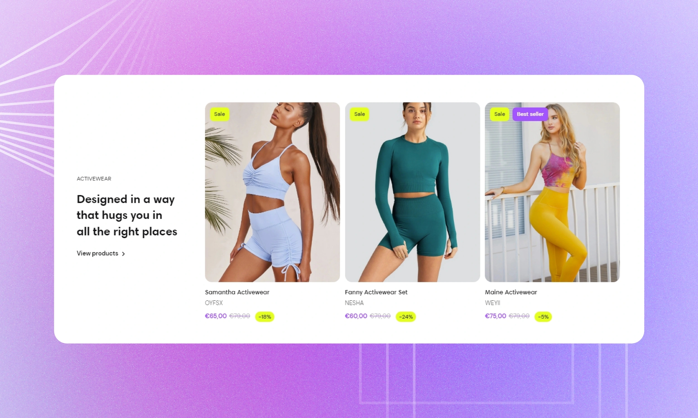
Collection with text
Pair the collection carousel with text to draw customers' attention to the collection and tell the story about it: how the collection was created and what it was inspired by.
GENERAL
Color scheme
Choose a separate color scheme for the section.
Width
Choose the width of the section on the page.
Layout
Choose the collection carousel layout against the welcome content of the section. Note that on mobile devices, small screens, and browser windows that fit less than 768 pixels, the carousel always appears at the bottom.
COLLECTION
Select a collection from the list of your collections on the setting panel.
ICON
Icon
Choose the icon to match the collection. Here you can see what icon stands for each label.
Custom icon
Select an image for a custom icon (the recommended image size is 256x256 pixels). In this case, the custom icon has priority over the icon from the list. You can choose images either from your library or the free images collection. Note that the free images you use are also saved to your library. You can further edit the uploaded image: add a focal point and fill in an alt text.
CONTENT
Subheading
Fill in the subheading to draw customers' attention to the content.
Heading
Fill in the heading to introduce the collection.
Body
Fill in the body with the information about the collection.
Heading size
Choose the font size for the content heading.
Body size
Choose the font size for the content body. Note that the option applies only to the 'Paragraph' body text formatting.
Link label
Fill in the link name to introduce the page it redirects to. Without a name, the link label disappears.
Link
Choose a page within your store or enter a URL to redirect customers to another page when they select the link. Note that the link doesn't work without the link label filled in.
Content alignment
Choose the content alignment within its part of the section.
CARDS
Image ratio
Choose the view and orientation of product media within cards.
Content alignment
Choose product information alignment under the image.
Desktop cards per row
Adjust how many cards show in the carousel at once.
Desktop space between cards
Adjust the spacing between the cards within the section.
Mobile space between cards
Adjust the spacing between the cards within the section.
Show arrows on hover
Select to show arrows on the sides of the carousel only when you place the pointer on cards.
AUTOPLAY
Autoplay mode
Choose the way the cards change on the screen. Note that the autoplay pauses when you place the pointer on the cards on desktop or swipe them left or right on mobile.
Autoplay speed
Adjust the card change speed.
PADDINGS
Add side paddings
Select to add extra space on the sides between the section and the screen.
Top padding
Adjust the space between the section and the previous element on the page.
Bottom padding
Adjust the space between the section and the following element on the page.
Last updated