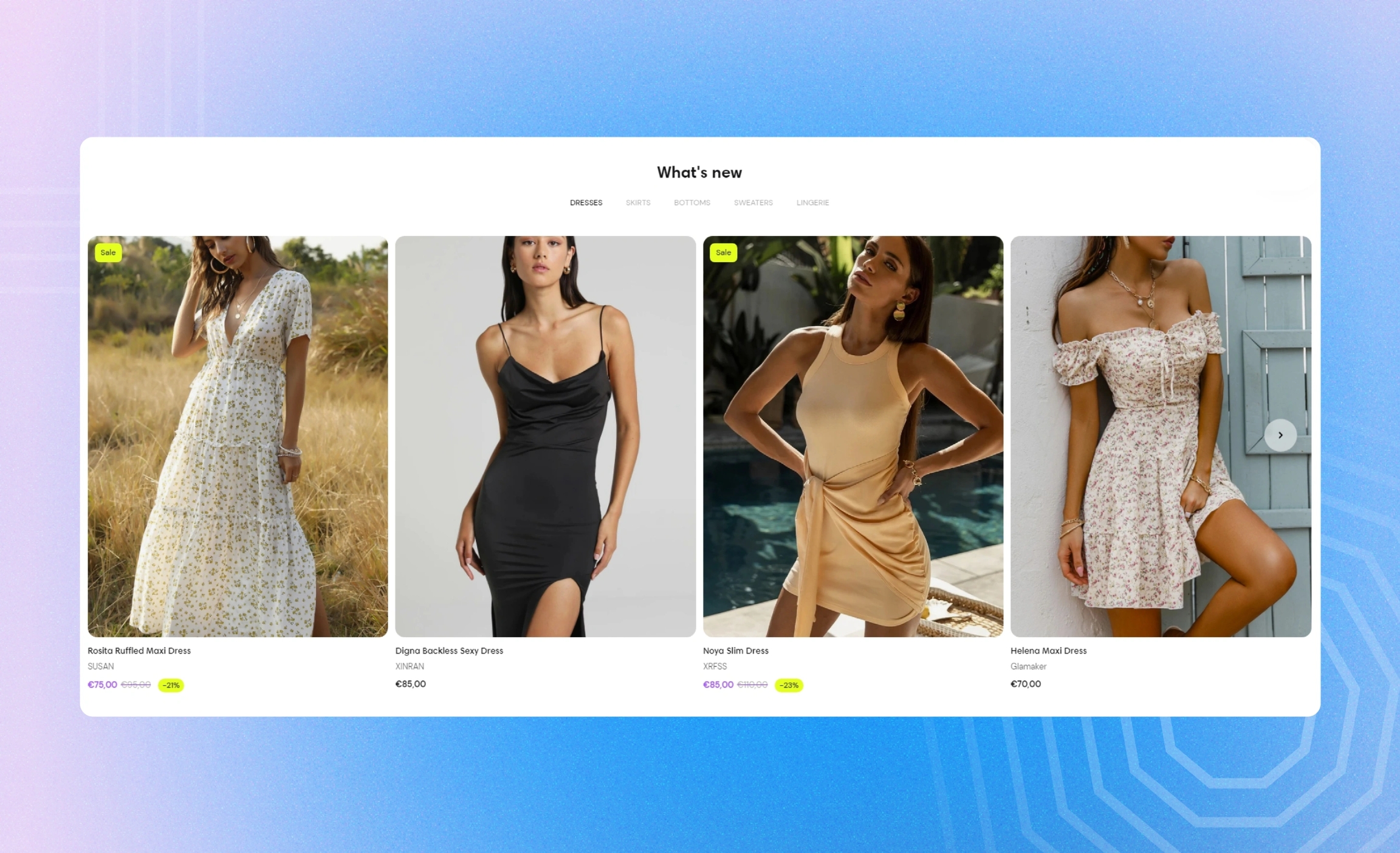
Multiple collections
Use this section to show the products for the recent or most popular collections. Switch between the selected collections on the tab panel over the row of products.
GENERAL
Color scheme
Choose a separate color scheme for the section.
Width
Choose the width of the section on the page.
Desktop layout
Choose the layout of the section on desktop.
Grid | a static view with multiple rows |
Carousel | a scrollable view with one row and navigation arrows on sides |
Slider | a scrollable view with one row and a progress bar at the bottom |
Mobile layout
Choose the layout of the section on mobile.
Carousel | a scrollable view with one and a half cards showing at a time |
1 column | a static one-column view |
2 columns | a static two-column view |
COLLECTION
Heading
Fill in the heading with the text to group the collections under or to draw customers' attention.
Heading size
Choose the font size for the heading.
Heading alignment
Choose the heading alignment over the row of products.
Collections
Select up to five collections from the list of your collections on the setting panel. Adjust their appearance on the tab panel from left to right by dragging them up and down to the desired place.
CARDS
Image ratio
Choose the view and orientation of product media within cards.
Content alignment
Choose product information alignment under the image.
Cards to show
Adjust the maximum number of product cards to appear in the section.
Desktop cards per row
Adjust how many cards show in the row at once.
Desktop space between cards
Adjust the spacing between the cards within the section.
Mobile space between cards
Adjust the spacing between the cards within the section.
Show arrows on hover
Select to show arrows on the sides of the carousel only when you place the pointer on cards.
COLLECTION CARD
Card position
Choose whether and where to place the collection cards among the product cards.
Content position
Choose collection information position within the card, either on or under the image.
Content alignment
Choose collection information alignment within the card.
Collection title size
Choose the font size for the collection titles.
Show product count
Select to show how many products each collection includes.
Overlay opacity
Dim the image to increase legibility of the content in the foreground. Note that the setting applies only if you choose the ‘on image’ content position.
AUTOPLAY
Autoplay mode
Choose the way the cards change on the screen. Note that the autoplay pauses when you place the pointer on the cards on desktop or swipe them left or right on mobile.
Disabled | turns off the autoplay |
One-at-a-time | turns on the instant change of one card to another on the screen |
Seamless | turns on the smooth and gradual card change |
Autoplay speed
Adjust the card change speed.
PADDINGS
Add side paddings
Select to add extra space on the sides between the section and the screen.
Top padding
Adjust the space between the section and the previous element on the page.
Bottom padding
Adjust the space between the section and the following element on the page.
Last updated