Product cards
Adjust product card appearance throughout your store, for example, in recommended products carousel, in the products list within a collection, or on the search page.
GENERAL
Default image ratio
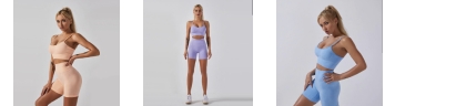
Choose the view and orientation of product media within cards that initially applies to all your newly added store components. This ratio goes under the 'Default' option in the image ratio dropdown list of every section. When you change the 'Default' image ratio, it consequently changes the orientation of product media within cards in all the sections and blocks with 'Default' value. This way, you can change the look of all product cards within your store with just one click.
You can also choose a fit for the media within product cards.
Fill | Stretches the image to fill the entire product card, even if it crops the image. Use it if most product media have the same resolution as the product card, or slightly larger. |
Fit | Scales the image to fit the product card without cropping or distorting it. You can use it with product media of any size. However, note that if the images have smaller resolution than the card, blank bars appear on the sides or top and bottom. |
Show vendor
Select to show the name of the product vendor. Note that selecting the vendor name redirects to the list of all products filtered by this vendor.
Show currency code
Select to show the currency code next to the price, for example, EUR or USD.
Show color count
Select to show the number of color options available for every product. Note that the counter applies only to the ‘Color’ option name for your products in admin.
Color card background
Select to show a solid color square in the background of the cards to make them more distinct.
Darken image background
Select to make the background of product images gray. This can be useful if your product media have a white or transparent background that blends into the color of the page.
Product rating
Choose the view of the product rating scale. Note, that to show dynamic product rating, you need to add a product reviews app and link the app with the theme in Advanced theme settings.
None | hides the product rating | |
Stars only | shows only the five-star scale | |
Review count only | shows the star and the number of reviews | |
Average rating only | shows the star and the average rating | |
Review count and stars | shows the five-star scale and the number of reviews | |
Average rating and stars | shows the five-star scale and the average rating |
Price label size
Choose the size of the price on product cards.
Image hover effect
Choose the media that appears when you place the pointer on the card image.
None | turns off hover effects |
Zoom | shows the same card image enlarged |
Show all media | turns on a slideshow with all the images or videos available for the product |
Show second media | shows the second image or video from the list of media available for the product |
SWATCHES
Adjust the view of swatches on product cards.
What to show
Choose what type of media to show inside the swatches on the product card. Note that you can adjust the shape and size of swatches in the swatches settings.
Colors and patterns | plain colors or images with patterns and textures; learn how to add colors and patterns to swatches | |
Variant images | the images you add to color variants of your products in admin; learn how to add images to variants in Shopify |
Show on desktop
Choose when to show swatches on the product card.
Show on mobile
Choose when to show swatches on the product card.
Hide for single-value products
Select to hide the swatches on the product cards if the product has only 1 primary swatch option value.
QUICK BUY BUTTONS
Adjust 'Quick view' and 'Add to cart' buttons on product cards.
Show 'Quick view'
Select to show the 'Quick view' button on the card image.
Show 'Add to cart'
Select to show the 'Add to cart' button on the card image. Note that the button appears only if the product has 1 variant so that you can add it directly to the cart without having to choose options.
Desktop button style
Choose whether to show 'Quick view' and 'Add to cart' as small buttons with icons or full-width buttons with labels. Note that button labels appear when you place the pointer on the button.
Show buttons on hover
Select to show 'Quick view' and 'Add to cart' buttons only when you place the pointer on the card image.
PRODUCT BADGES
Choose what badges to show on product cards. You can adjust their view and colors in the theme settings for product badges.
Desktop position
For desktop view, choose the badges’ position within the product card, either on or under the image. Note that on mobile devices, small screens, and browser windows that fit less than 768 pixels, the badges always appear under the image.
Show ‘Sold out’ badge
Select to show the badge for the products out of stock.
Show ‘Sale’ badge
Select to show the discount badge for the products on sale.
Show ‘Sale’ badge next to price
Select to show the discount badge for the products on sale that appears next to the price.
Highlight sale price
Select to color the final price for the products on sale.
Show ‘Custom 1 to 3’ badge
Select to show custom badges you create by linking them to product tags. Learn how to use product tags in Shopify.
Last updated