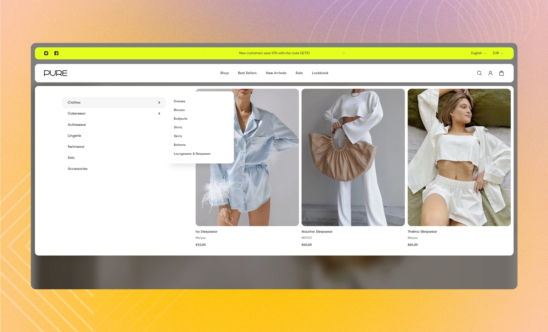
Featured collection
Select a collection and attach it to the menu item so that it appears as the carousel of product cards when you open the menu tab.
GENERAL
Link to menu item
Fill in the name of the menu item to link the block to, for example, 'Home'. The block appears next to the first menu level when you select this menu item in the header. Note that as you open the dropdown sub-menus within the menu item, the block remains in the background.
Visibility
Choose on what types of devices to show the block.
COLLECTION
Collection
Select a collection from the list of your collections on the setting panel. Note that if you already selected products, the collection will not appear.
Products
Select the products from the list of your products on the setting panel. Note that products have priority over a collection.
CARDS
Image ratio
Choose the view and orientation of product media within cards.
Content alignment
Choose product information alignment under the image.
Desktop cards per row
For non-drawer menu layouts, adjust how many cards show in the carousel at once.
Desktop space between cards
For non-drawer menu layouts, adjust the spacing between the cards within the block.
Desktop paddings
For non-drawer menu layouts, adjust the spacing between the borders of the block and the content within it.
Drawer space between cards
For the drawer menu layouts on desktop and mobile, adjust the spacing between the cards within the block.
Drawer paddings
For the drawer menu layouts on desktop and mobile, adjust the spacing between the borders of the block and the content within it.
AUTOPLAY
Autoplay mode
Choose the way the cards change on the screen. Note that the autoplay pauses when you place the pointer on the cards on desktop or swipe them left or right on mobile.
Disabled | turns off the autoplay |
One-at-a-time | turns on the instant change of one card to another on the screen |
Seamless | turns on the smooth and gradual card change |
Autoplay speed
Adjust the card change speed.
Last updated
