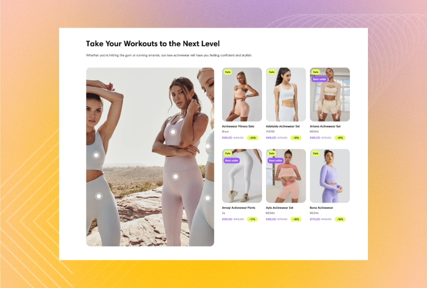
Lookbook
Use this section to showcase a set of products in one featured image. Identify the products in the image and arrange them the way you want.
GENERAL
Color scheme
Choose a separate color scheme for the section.
Width
Choose the width of the section on the page.
Enable pins
Select to show the pins that indicate the location of products in the featured image.
CONTENT
Heading
Fill in the heading to introduce the content of the featured image.
Body
Fill in the body with the information about the featured image and its products.
Heading size
Choose the font size for the content heading.
Body size
Choose the font size for the content body. Note that the option applies only to the 'Paragraph' body text formatting.
Content alignment
Choose the content alignment within the section.
IMAGE
Desktop image
Select a featured image for the section. You can choose images either from your library or the free images collection. Note that the free images you use are also saved to your library. You can further edit the uploaded image: add a focal point and fill in an alt text.
Use custom ratio
Select to enable the featured image ratio adjustment on desktop. Otherwise, the selected desktop image uses its original ratio.
Desktop custom ratio
Adjust the proportion between the width and height of the featured image and make its orientation square, horizontal, or vertical. Note that you can use this option only when 'Use custom ratio' is selected.
Mobile image
Select a featured image for the section. You can choose images either from your library or the free images collection. Note that the free images you use are also saved to your library. You can further edit the uploaded image: add a focal point and fill in an alt text.
Use custom ratio
Select to enable the featured image ratio adjustment on mobile. Otherwise, the selected mobile image uses its original ratio.
Mobile custom ratio
Adjust the proportion between the width and height of the featured image and make its orientation square, horizontal, or vertical. Note that you can use this option only when 'Use custom ratio' is selected.
CARDS
Desktop position
Choose the position of the product cards against the featured image. Note that on mobile devices, small screens, and browser windows that fit less than 768 pixels, product cards always appear at the bottom.
Desktop layout
Choose the product card list layout on desktop.
Grid - 1 column | a static view with 1 column and multiple rows |
Grid - 2 column | a static view with 2 columns and multiple rows |
Grid - 3 column | a static view with 3 columns and multiple rows |
Carousel - 1 card | a scrollable one-row view with 1 card showing at a time |
Carousel - 2 cards | a scrollable one-row view with 2 cards showing at a time |
Carousel - 3 cards | a scrollable one-row view with 3 cards showing at a time |
Slideshow - 1/2 section | a scrollable one-card view with navigation circles at the bottom that occupies 1/2 of the section |
Slideshow - 1/3 section | a scrollable one-card view with navigation circles at the bottom that occupies 1/3 of the section |
Mobile layout
Choose the product card list layout on mobile.
Grid | a static view with 2 columns and multiple rows |
Slideshow | a scrollable one-card view with navigation circles at the bottom |
Carousel popup | a scrollable view with one and a half cards showing at a time; it pops up when you tap the product pins or the icon in the corner of the featured image |
Slideshow popup | a scrollable one-card view with navigation circles at the bottom; it pops up when you tap the product pins or the icon in the corner of the featured image |
Carousel with vertical cards | a scrollable view with one and a half cards showing at a time and a vertical card style |
Carousel with horizontal cards | a scrollable view with one and a half cards showing at a time and a horizontal card style |
Image ratio
Choose the view and orientation of product media within cards.
Content alignment
Choose product information alignment under the image.
Desktop gap
Adjust the spacing between the featured image and the list of product cards.
Desktop space between cards
Adjust the spacing between the cards within the section.
Mobile gap
Adjust the spacing between the featured image and the list of product cards.
Mobile space between cards
Adjust the spacing between the cards within the section.
PIN COLORS
Inner
Pick the color for the central area of the pin.
Outer
Pick the color for the outer outline of the pin.
PADDINGS
Add side paddings
Select to add extra space on the sides between the section and the screen.
Top padding
Adjust the space between the section and the previous element on the page.
Bottom padding
Adjust the space between the section and the following element on the page.
ADD PRODUCTS
Add the products that appear in the featured image.
pageProductLast updated