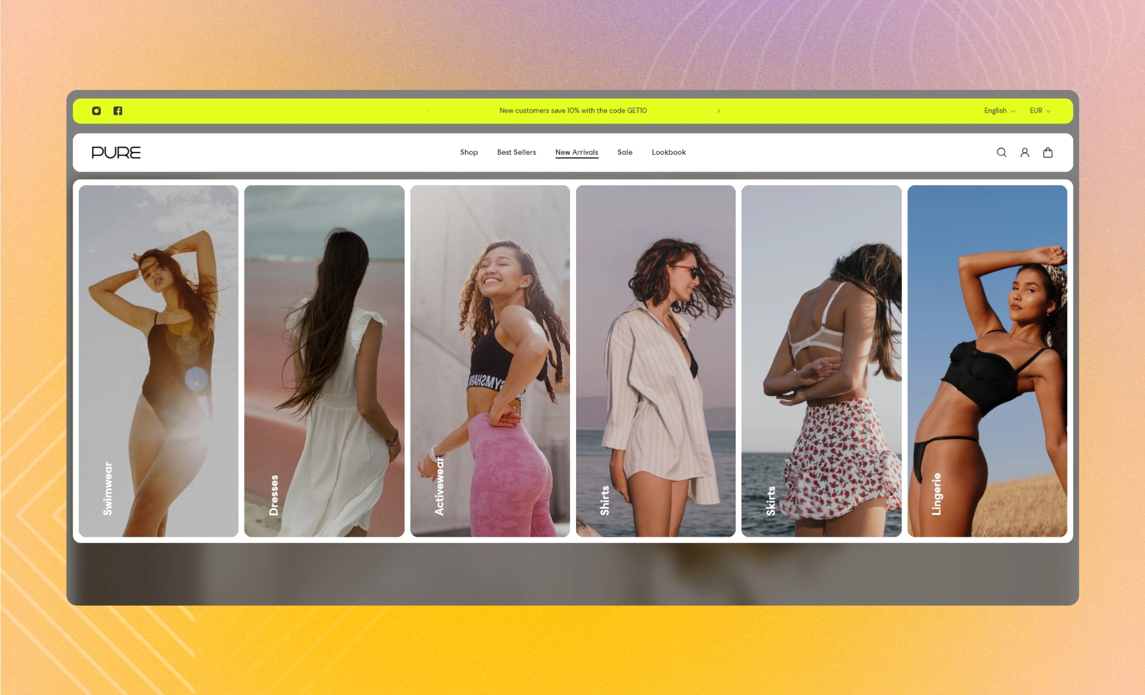
Images
Add up to nine images to the menu item to show your products, provide important information about your store and serve as links to other pages, external or within the store.
GENERAL
Link to menu item
Fill in the name of the menu item to link the block to, for example, 'Home'. The block appears next to the first menu level when you select this menu item in the header. Note that as you open the dropdown sub-menus within the menu item, the block remains in the background.
Visibility
Choose on what types of devices to show the block.
Color scheme
Choose a separate color scheme for the block.
CARDS
Desktop image ratio
For non-drawer menu layouts, adjust the proportion between the width and height for all images, and make their orientation square, horizontal, or vertical.
Desktop cards per row
For non-drawer menu layouts, adjust how many cards show in the row at once.
Desktop space between cards
For non-drawer menu layouts, adjust the spacing at the top, bottom, and sides between the images within the block.
Desktop paddings
For non-drawer menu layouts, adjust the spacing between the borders of the block and the content within it.
Drawer image ratio
For the drawer menu layouts on desktop and mobile, adjust the proportion between the width and height for all images, and make their orientation square, horizontal, or vertical.
Drawer space between cards
For the drawer menu layouts on desktop and mobile, adjust the spacing at the top, bottom, and sides between the images within the block.
Drawer paddings
For the drawer menu layouts on desktop and mobile, adjust the spacing between the borders of the block and the content within it.
CONTENT
Heading size
Choose the font size for the content heading on images.
Body size
Choose the font size for the content body on images. Note that the option applies only to the 'Paragraph' body text formatting.
Desktop position
For non-drawer menu layouts, choose the content position within the image.
Drawer position
For the drawer menu layouts on desktop and mobile, choose the content position within the image.
Vertical text
Select to make text orientation on images vertical.
Overlay opacity
Dim images to increase legibility of the content in the foreground.
Show on hover
Choose what content appears when you place the pointer on the image.
All content | text content and button are initially missing and appear on hover |
Button only | only text content is initially present, and on hover, it is replaced by a button |
Body and button | only heading and subheading are initially present, and on hover, they are replaced by a body text and a button |
Zoomed image | text content and button are initially present; on hover, only the image is enlarged |
IMAGE 1 TO 9
Show image
Select to show the adjusted image. Without the selected box, the image is hidden.
Image
Select an image to add to the block. You can choose images either from your library or the free images collection. Note that the free images you use are also saved to your library. You can further edit the uploaded image: add a focal point and fill in an alt text.
Video
You can add a video instead of an image. In this case, the video has a priority. You can either choose a video from your files or upload a new video from your device. Note that the newly added videos are also saved to your files. You can further edit the uploaded video: add a cover image and fill in an alt text.
Heading
Fill in the heading to state what you want to convey.
Body
Fill in the body with the information you want to convey.
Button label
Fill in the button name to introduce the page it redirects to. Without a name, the button disappears or turns into an icon with an arrow. It depends on the chosen hover effect.
Button link
Choose a page within your store or enter a URL to redirect customers to another page when they click on the button or the image.
Button style
Choose the style of the button.
Solid | the button filled with color |
Outline | the button with only its borders colored |
Text | the label with an arrow icon |
Last updated