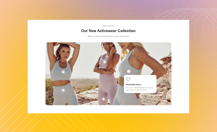
Hotspots
Use this section to turn an image into an interactive exploration activity. You can both showcase products and provide some important details about your brand. These pieces of information appear as hotspots in the featured image.
GENERAL
Color scheme
Choose a separate color scheme for the section.
Width
Choose the width of the section on the page.
Layout
Choose the layout of the featured image against the welcome content of the section. Note that on mobile devices, small screens, and browser windows that fit less than 768 pixels, the image always appears at the bottom.
Open hotspots
Choose how to reveal the hotspot content pinned to the featured image.
On hover |
opens the hotspot content when you place the pointer on the pin |
On click | opens the hotspot content when you click the pin |
CONTENT
Subheading
Fill in the subheading to draw customers' attention.
Heading
Fill in the heading to introduce the content of the featured image.
Body
Fill in the body with the information about the featured image and its hotspots.
Heading size
Choose the font size for the content heading.
Body size
Choose the font size for the content body. Note that the option applies only to the 'Paragraph' body text formatting.
Content alignment
Choose the content alignment within the section.
IMAGE
Desktop image
Select a featured image for the section. You can choose images either from your library or the free images collection. Note that the free images you use are also saved to your library. You can further edit the uploaded image: add a focal point and fill in an alt text.
Use custom ratio
Select to enable the featured image ratio adjustment on desktop. Otherwise, the selected desktop image uses its original ratio.
Desktop custom ratio
Adjust the proportion between the width and height of the featured image and make its orientation square, horizontal, or vertical. Note that you can use this option only when 'Use custom ratio' is selected.
Mobile image
Select a featured image for the section. You can choose images either from your library or the free images collection. Note that the free images you use are also saved to your library. You can further edit the uploaded image: add a focal point and fill in an alt text.
Use custom ratio
Select to enable the featured image ratio adjustment on mobile. Otherwise, the selected mobile image uses its original ratio.
Mobile custom ratio
Adjust the proportion between the width and height of the featured image and make its orientation square, horizontal, or vertical. Note that you can use this option only when 'Use custom ratio' is selected.
PIN COLORS
Inner
Pick the color for the central area of the pin.
Outer
Pick the color for the outer outline of the pin.
PADDINGS
Add side paddings
Select to add extra space on the sides between the section and the screen.
Top padding
Adjust the space between the section and the previous element on the page.
Bottom padding
Adjust the space between the section and the following element on the page.
ADD HOTSPOTS
Add blocks to the section as the hotspots that appear in the featured image. Choose between the three types of hotspots with different layouts.
pageImage with textpageIcon with textpageProductLast updated