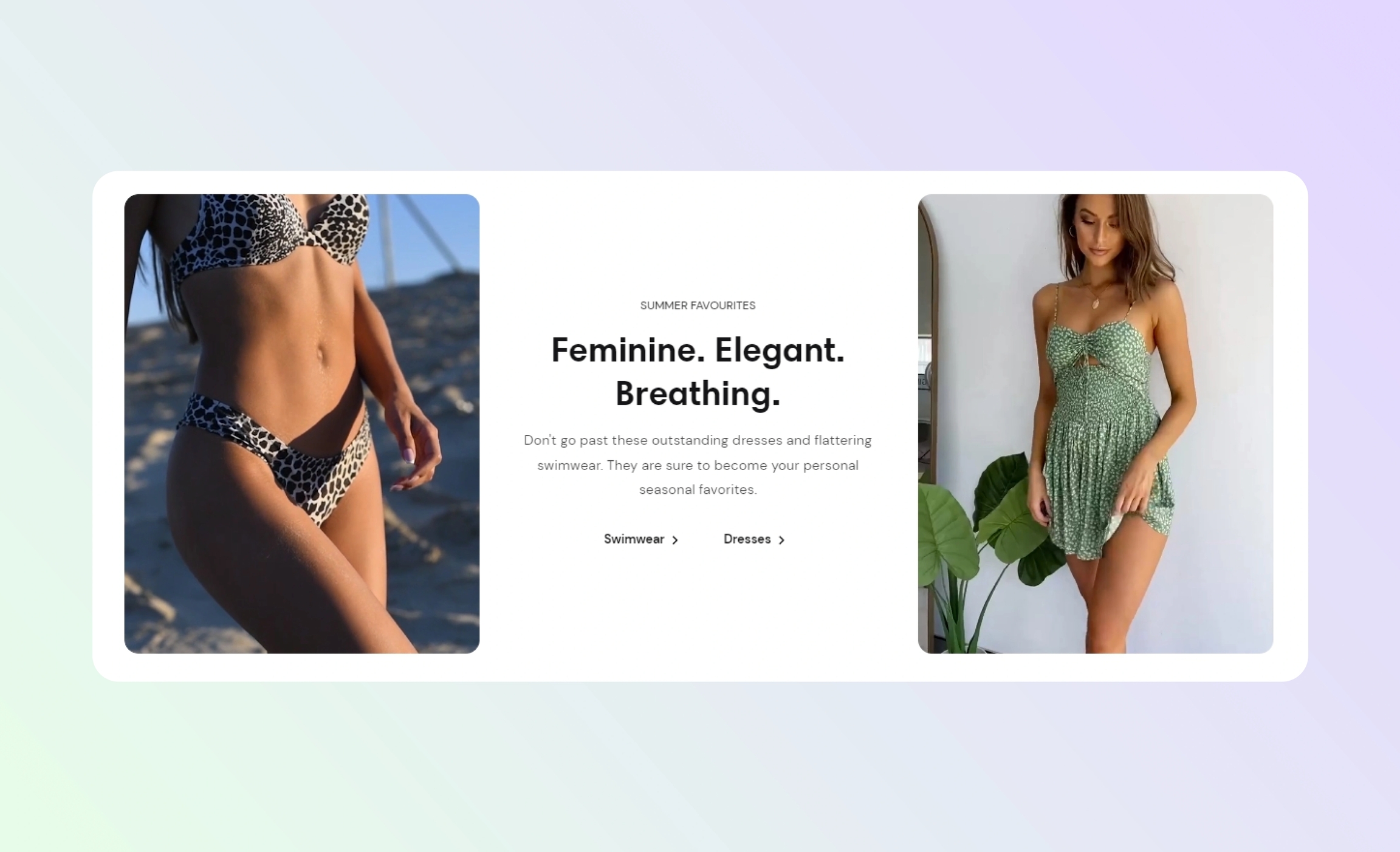
Split image banner
The section features two different images with text content in between. Use it to share with customers the latest news about your store or draw attention to new collections.
GENERAL
Color scheme
Choose a separate color scheme for the section.
Color background
Select to apply the color scheme of the section to its background. Note that the section background does not show with screen width and zero paddings.
Width
Choose the width of the section on the page.
Desktop ratio
Adjust the proportion between the width and height of the two images within the section and make their orientation square, horizontal, or vertical. Note that the ratio adapts to the section content: as the content volume increases, the section height increases as well.
Image proportion
Adjust the image proportion by width and the position of the content column between the two images for desktop view.
Desktop content column width
Adjust the width of the column with text content between the images.
LEFT IMAGE
Desktop image
Select an image for the banner. You can choose images either from your library or the free images collection. Note that the free images you use are also saved to your library. You can further edit the uploaded image: add a focal point and fill in an alt text.
Mobile image
Select an image for the banner. You can choose images either from your library or the free images collection. Note that the free images you use are also saved to your library. You can further edit the uploaded image: add a focal point and fill in an alt text.
Video
You can add a video instead of an image. In this case, the video has a priority. You can either choose a video from your files or upload a new video from your device. Note that the newly added videos are also saved to your files. You can further edit the uploaded video: add a cover image and fill in an alt text.
RIGHT IMAGE
Desktop image
Select an image for the banner. You can choose images either from your library or the free images collection. Note that the free images you use are also saved to your library. You can further edit the uploaded image: add a focal point and fill in an alt text.
Mobile image
Select an image for the banner. You can choose images either from your library or the free images collection. Note that the free images you use are also saved to your library. You can further edit the uploaded image: add a focal point and fill in an alt text.
Video
You can add a video instead of an image. In this case, the video has a priority. You can either choose a video from your files or upload a new video from your device. Note that the newly added videos are also saved to your files. You can further edit the uploaded video: add a cover image and fill in an alt text.
CONTENT
Subheading
Fill in the subheading to draw customers' attention.
Heading
Fill in the heading to state what you want to convey.
Body
Fill in the body with the information you want to convey.
Heading size
Choose the font size for the content heading.
Body size
Choose the font size for the content body. Note that the option applies only to the 'Paragraph' body text formatting.
Desktop content width
Adjust the maximal content width within the column between the images. Note that as the content volume decreases, the width decreases as well.
Desktop alignment
Choose the content alignment within its column.
Mobile alignment
Choose the content alignment within its column.
BUTTONS
First button label
Fill in the button name to introduce the page it redirects to. Without a name, the button disappears. Note that if you don't fill in both button labels, the whole banner will be the button for the link ('First button link' has the priority between the two).
First button link
Choose a page within your store or enter a URL to redirect customers to another page when they select the button.
First button style
Choose the style of the button.
Solid | the button filled with color |
Outline | the button with only its borders colored |
Text | the label with an arrow icon |
Second button label
Fill in the button name to introduce the page it redirects to. Without a name, the button disappears. Note that if you don't fill in both button labels, the whole banner will be the button for the link ('First button link' has the priority between the two).
Second button link
Choose a page within your store or enter a URL to redirect customers to another page when they select the button.
Second button style
Choose the style of the button.
Solid | the button filled with color |
Outline | the button with only its borders colored |
Text | the label with an arrow icon |
PADDINGS
Add side paddings
Select to add extra space on the sides between the section and the screen.
Top padding
Adjust the space between the section and the previous element on the page.
Bottom padding
Adjust the space between the section and the following element on the page.
Last updated